Monday, 5 August 2013

Resub// CG on Live action


My CG on live action file broke and I had no way to recover it so I'm going to explain the way I did it before it broke. Firstly I had to get my boxhead character spaceship to perform a simple drop in, in maya, by way of making a simple vertical moving down animation. Once with was done I had to use a virtual camera on Maya to record this animation, so what I would be left with is a black screen with a small red spaceship descending into it. This was saved as an image sequence.


Above is what I was left with after taking the animation into after effects. Now it was time to layer this onto the live action footage I had so it would look like the alien ship is dropping down onto the actor below.

I then added some shadows too make it look a bit more realistic. I would have liked to have spent more time on this as towards the end of doing these visual I actually started to enjoy it, but under the pressure of resubmission it was hard to enjoy it fully. 


ResubPPP// Filminute


After being sent a link to this I decided to enter it with something I had been putting together for fun in the previous weeks. The video i had been making was mostly just to get me to grips with premiere pro but as I learned more and more about the program the video started to evolve and I thought it would be a good idea to submit it

The video is mostly moving mirrored panning shots which i have edited together so they flow into one another, and I experimented with the mirror tool and key framing the the opacity to create some interesting effects. Here are some screen shots:


ResubPPP// The Film Till Now

 The Film Till Now is a book I have recently started reading which gives a vast and intricate look at film from its start to now. My first impressions are that Richard Griffith and Paul Rotha know exactly what they are talking about and from what I've read share a lot of the same opinions as I do, about how the industry is developing and the dangers and threats to good quality motion pictures. I did a bit of research on the book as well and this book is essentially the filmmakers bible to quote the author of the blurb, so this encourages me that i'm looking at a credible source.

I plan on studying this book heavily throughout the rest of the summer and next year as I think it could hold a lot of interesting secrets that maybe others (threats) may not know about either. I also think I need to start reading more again as books hold such a fountain of knowledge that won't be hampered by a poor internet connection or running out of battery, like most things these days do. There are also many chapters in this book which I'm looking forward to reading, such as, The American Film. As we all know Hollywood has dominated the film industry since, almost, it began, and because of this i am fascinated by the world of Hollywood and the immense value and quality of their pictures. But as I have already read there are many people in the industry who's only concern is too churn out pictures that only appeal to the widest audience to get the maximum amount of revenue. I totally agree with Griffiths here that, that is a terrible way to make a movie as it pushes out the artists and visionaries who want to make a film because they want to say something or make a work of art because they love films.

I'm also interested in the British film section as despite Hollywoods dominance I still think Britain can contest America for greatest film producing country. A modern example of how these two countries rival each other is in films like 'This is The End' and 'The Worlds End' both seem to be similar movies but with a british or american take. I haven't seen either but I've seen others which have precluded these and despite the general hilarity of the american ones I think the cleverer and more relatable british films are better, such as 'Hot Fuzz' and 'Shaun of the Dead', as opposed too american films like 'Pineapple Express' and 'Knocked Up' which are both hilarious films are both are well made, but don't have the same level of comedy that the other two do. It may be because i'm british but in 'Shaun of the Dead' for example, there are many 'easter eggs' and things you may miss the first time round watching. For instance in 'Shaun of the Dead' Ed points out a man in the pub called 'Snakehips' and that 'he's constantly surrounded by women''. Later on in the movie when they're all making their way back to the pub to hunker down. Lizz asks shaun if they're close, to which the camera pans to the body of 'Snakehips' who is being eaten by only female zombies. It doesn't seem like much but I think its these little details which makes these films better.

I plan on reading this book much more fully in the coming year as it seems that it could be very helpful.


Friday, 2 August 2013

Resub// Compositing


After completing the live action on live action it was time to move on to the live action on CG background. The first step for this was to key out the character from the green screen background. After having done this before I found this straightforward and it took a lot less time to acquire a well keyed out character.

I also had to make a background for the clip to be composited onto. The background was made in Maya with the cube tool and hyper shade and I think provides a rugged simple background for the actor to stand against. Its important to change the colour between the wall and the floor as it adds a better depth of field


I was going to add some shadows but there already appears to be some at the actors feet so I thought it was best to leave the shadows incase i added some which didn't blend with the environment or the original shadows.

This was a simple enough process to get my head around but I know now that I can definitely take these skills to the next level with some more practice, and apply these skills to future pieces of work. 
However I know I have to get better at this as my CG will look too much like its CG and then ruin the film and make me look like a hypocrite. But as long as its done well  I can get away with some green screen.

Resub// Spaceship and Character design.


For the CG on CG and Live action on CG portions of the module I have decided to take a very much simplistic approach as I can't operate maya to an acceptable standard any more, after much time way from it. However simplistic doesn't mean bad and I'm obtaining influence from an internet game called Boxhead. The design of their characters is very simple but works really well in a low resolution game environment


Above is a video of boxhead zombies. Doesn't look similar to mine really but it was the simplicity of the design which I took inspiration from. The animation was also very simple which again I took inspiration from as I'm not the best at it.


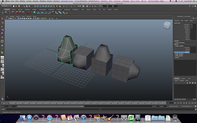
These screen shots are showing the development from the drawings I have shown previously of blockman. Like I said I have taken a more of a minimalist approach this time as time is against me. So I decided to go with the Blockman idea. I just simply create a cube on maya. Then I used to insert edge loop tool to create two squares on the front face, from which I could extrude eyes and eyebrows from. As the blockman design is very simple I decided to extend this principal to the spaceship and simply extrude two of the sides, narrow them a bit at the ends, and then create a tail out of a bit more extruding of the shapes left on the back face by the insert edge loop tool. The eyes were simple enough, two spheres, which were then inserted into the block eyes.


The next stage was to colour the blocks with something a bit more interesting than the stock grey. I decided to use toon shaders again as my skills with texturing are about as good as my maya skills. I used the colour from the examples I had drawn to get the scheme accurate then I used the toon shader to mirror the ones from my own swatch,

The colours definetly bring the block to life especially when you select the front face of the eye and change it white, I also changed the pupil black so you could see it against the white.


 I think I prefer the red most for the spaceship and I dont know if the colour of the ship necessarily dictates the colours of the little cubes.

I prefer the difference in colour on the blue and It might show up better against the live action background

 All the greens are too similar, resulting in little definition. So I wont use this colour scheme for the ship.


The white of the eyes shows up really well on the green so i'm going to make one of the cubes green.


As they show up so well here as well Im going to have one of the cubes blue and the final one red all in a red space ship.


ResubPPP// SWOT Analysis of myself.

SWOT Analysis

S - Strengths
W - Weaknesses
O - Opportunities
T - Threats

I've never felt that comfortable with evaluating myself as I never know whether to be too harsh or to lenient. But here goes,


Strengths

I think doing my SWOT now is a much easier task than doing it at the beginning of the year as my film related skills have improved a lot since then. I feel like i'm most improved in the area of editing and getting to grips with editing software as a general medium. I first started on Final Cut Pro X, this piece of software confused me as it was a slimmed down, user friendly, and just not the same of Final Cut Pro 10.0.0 which I learnt in first year. Despite Final Cut X being vastly less superior than its predecessor it did give me a good basic understanding of editing software before moving on and up to Premiere Pro.
        Premiere Pro is a vastly more intricate and better laid out than Final Cut X. The software is far more detailed and more simple in a lot of ways. It flows much better and the drop downs and location of tools are much easier. Premieres simplicity enabled me too get to grips with editing much better and I think this has helped me improve as a director as a result. Because after learning how something will be edited together enables you to vision your own films more easily

I think i've got a good eye for comedy and know what is and isn't funny, as well as knowing what is and isn't scary. Which will help me with writing stories for films which i'm not very good at currently. I also have now purchased a camera which has massively helped my drive and will to go and film things no matter what it may be. A bonus is that i'm using my camera and always learning about it and the things it does and how to improve the quality of the shots I make.

I'm pretty handy with a computer in general as well and this is definitely a sought after talent, in this day and age. Even though thousands of people know how to operate one they don't know how to solve a problem should it arise and I can.

Weaknesses

I believe my weaknesses lie in areas like networking. In the sense that I need to do far more of it so I can help advertise myself as a director/filmmaker more easily. To help combat this I've set up a facebook page called 'The Film Files' which gives people an idea of what to watch and what to not and this constant exposure too films and how they are put together is helping my internet presence and my knowledge of what a good and what a bad film is. I also have a flickr and youtube accounts to upload screenshots and videos respectively.
Despite making leaps and bounds in my editing skills I still think I am fairly weak in this area and I have been editing all sorts of random things purely to improve my skills. Premiere Pro is an extensive program which will need a lot more
I've also had a lot a of problems with organisation and time management, for next year I need to apply certain rules to myself in order to make sure that I hit deadlines and I am on time for studio sessions. I've started to combat this by getting started on my dissertation now so i'm far more prepared for the coming year.

Opportunities

I've had a fair few opportunities recently which will be a big help too my development as a filmmaker/director. Recently I have been asked to do some shooting at a local clothing company, no details have been disclosed yet but I think this is a great opportunity to get my first professional video done. I have also received some emails with production news for the next few years. This document has provided me with many places where I could potentially get work experience, like harbour studios and the Imaginarium. These are opportunities which I can't afford too miss as the film set experience would be invaluable, it would also give me a lot of good connections in the film world which would probably lead to my next job and so on. Imaginarium have said to me that it doesn't start shooting until next year but they've put my name down so i'm in their minds early on. I also have heard that Leeds council are looking to sell abandoned warehouses cheap to make film studios, as this is a better use of the space. If I could accomplish getting something like that it might be very profitable in the long run, but its just a pipe dream at the moment.

Threats

The only threats I can potentially see are from competitors in my own field as well as people competing for the same jobs i'm looking to work at. I also see money as a threat because It will be needed to help fund my own aspirations with equipment and I hope one day have money for a studio. Getting into the industry will be really difficult so I intent to arm myself with an armada of knowledge about video editing and film construction. I will learn new software like SpeedGrade and Dreamweaver so I make myself more employable across a wider range of jobs and so I can put myself ahead of my rivals, by knowing things that other filmmakers don't necessarily.

Thursday, 25 July 2013

ResubPPP// Nest Magazine

A while back Leeds College of Art's Nest magazine approached a friend of mine, Tom Stephens, to see if he wanted to film their second launch party. He agreed and then proceeded to ask me if I wanted to help and I obviously jumped at the opportunity to be behind the camera again. We weren't paid for this in any conventional terms but a free beer for a few hours work wasn't that bad at all.

I really enjoyed the experience despite it not being one of my most favourite things to film. Everything we did was valuable experience and experimenting with shot selection with close ups, pans and zooming shots all helped me to analyse the situation and deduce which shots would work the best.


As the launch wasn't that big there weren't a massive amount of variety of shots that we could use. But what we did get I thought was really good and the jazz band they hired did a really good job. I also liked getting to grips with the Sony XD cam which is more experience I can take into the industry should I ever have to use one.

I was only involved in the filming of the event as at the time my editing skills were less than average. However knowing this at the event gave me the motivation to go and start to learn how to use programmes like Premiere Pro. Which I am now very competent in using as a result.
However here is the link to final Nest video edited by Tom Stephens.

https://vimeo.com/63394156


ResubPPP// Flickr Account and Business cards

I have also set up a flickr account which I think will be very useful for me as I can upload screenshots from my videos to add more depth to them as viewing them as photos as well.


I really like Flickr and the way that its set out and even if i'm not noticed for me videos I can be noticed for these images which are screen shots of them. I have also made a YouTube and Vimeo account to upload videos to a quantity audience and quality audience respectively.

Although Vimeo is a fantastic website both visually and how easy it is to navigate I don't think its the one for me. Vimeo's quality ability doesn't not come without cost, actual cost, from you, every year, for about 40 quid. Now I know you pay for quality but you can get 1080p videos on YouTube and they look just as good as Vimeo. Vimeo would be a fantastic tool if you were already rich and could afford to pay for it every year, but alas, i'm not rich, and being rich also helps with filmmaking so Im going to either win the lottery or stick to YouTube.

Despite staying on YouTube its layout has nothing on Vimeo's. It looks like it was made overnight and looks more like a Facebook news feed other than anything else. More customisable options are needed I think.

I also emailed a company called Mama's Sauce which design and print business cards. Unfortunately when they replied they said that they wernt designing any at the moment but were very happy to print any designs that I had.


I'm definitely going to pursue this as some of their work is fantastic with business cards you would want as a piece of art. Plus business cards are a fantastic way to network and the better looking and sexier my business cards look the better and the more likely people will hang on to them whether they are looking for a filmmaker or not.


Monday, 22 July 2013

ResubPPP// The Film Files

Recently I decided to create a page about something I love, Films. My object with this is too try and educate people into which films they should be watching and the ones that should be avoided at all costs. The page isn't so much about full reviews but short snippets of information as well as pictures and  screenshots from the great films that have been made across the years.


I also think this page is a good way to go as it will enable me too broader my knowledge of the motion picture industry as well as learn more and more about how and why good films are good and exactly why the bad ones are rubbish. I post on this as often as I can, but so far I have put up 99% films that you should watch. However my thinking behind this is that it is always better to tell someone to watch a good film rather than tell them to avoid a bad one.

Its started off pretty well with a lot of my friends on facebook joining and liking the stuff I post, but I need it to get bigger so I can broadcast my opinions to a wider audience. I think that having a facebook page about films and the such is a good thing to tell an interviewer or potential employer as it shows a love for the job which is always vital in doing a good job.

I also hope that I can eventually fashion a website to the same effect as this page as it will also enable me too get acquainted with adobe Dreamweaver which will be an invaluable tool for me later in life. The facebook page is really just a link to the website through facebook.  

ResubPPP// Sixteen FIlms

Another company I've received info about is from Sixteen films. They Are currently putting together a film which is  a political thriller set after a nuclear attack. This is a fantastic premise for a film as the contradictory terms, nuclear and political, as after a nuclear attack there wouldn't exactly be a solid or even stable government. I'm very interested in how they will tackle this as I love the whole disaster/apocalypse genre, as most of them are not completely impossible. One thing I could foresee Sixteen encountering is making it exciting, as after a nuclear war people/situations aren't exactly going to be normal and people will be irrational and scared and will do stupid things. The political side to this needs to be interlinked with the ensuing madness which would be inevitable after a nuclear holocaust.


From their website they seem to have a really good collection of films they have produced. With some names I recognise like 'Looking for Eric' the story of Manchester United fan meeting his hero Eric Cantona. Sixteen films look like another really good quality production company which is another great avenue into the industry. Sixteen, Harbour and Imaginarium are all companies I'm going to be emailing, among others, next year to try and get work/placements. I'm looking a lot more towards paid work as it looks better on the CV and it would never be a bad thing to be paid to do something which I love. 


ResubbPPP// Harbour Pictures

Another company i'm going to be looking at is Harbour Pictures. They've got a lot of new productions coming up and I think it will be a great opportunity to link up with others in my field to try to get a lot more hands on film experience. This particular production is a remake of Arthur Ransom's  Swallows and Amazons. A wonderful tale of two families of children going on adventures in the lake district in northern England. My largest concern is that it wont be filmed in the lake district, it will be green screened in a studio in London, which I think would be a massive shame as the beauty and serenity of the english countryside should only be captured through a camera.

Harbour Pictures have produced two well known feature films: Calendar Girls and Kinky Boots. Kinky  Boots was actually filmed about 20 minutes from me as it focuses on the cobbling history of Northampton which is my closest town.


These smaller production companies are a good place for me to start getting film experience. Despite my final goal being a director I really want to work on a film set doing a variety of different jobs so I can get a good broad knowledge of the industry and how each and every individual cog works so when I come to direct my own team, i'm not under prepared because I havent seen how it operates before I attempt it. 

I havent been in contact with them like I have with Imaginarium, but I think that all of the companies I have been looking are valuable gateways into the industry and despite me favouring the stories of ones over others Im going to email and send covering letters to as many as I can find.

Sunday, 14 July 2013

ResubPPP// Imaginarium Studios

I was recently sent a production list for some films coming up in 2013, and I stumbled across one from Imaginarium Studios involving George Orwell's Animal Farm. I'm a big fan of the book and I subsequently emailed the studio asking if they had any places for me to be a part of this awesome looking project.  I then decided it would be a good idea to research what they did. The company is mainly centred around creating believable characters using performance capture technology, like Andy Serkis with Gollum, who incidentally, is who is directing and producing Animal Farm.

I'm not usually the biggest fan of CGI but Serkis is such a pioneer in this field with Gollum and King Kong that I decided that if anyone was going to use CGI well it was Andy Serkis and Imaginarium. I visited their website and found that is was very professionally, yet simply, laid out with some interesting graphics and animations. They also mention internships and placements on a section of their website and I'm going to send them a CV and covering letter to see if I can get involved on Animal Farm. I also rang the Imaginarium shortly after as I thought it would be a good way to get me into their minds and charm them a bit over the phone. I spoke to a nice receptionist who told me what I already knew and I told her that I had already sent an excited email to them regarding this project.


It turns out though that production of this isnt due to start till early 2014 which is definitely a bonus for me as it gives me time to send my CV and covering letter and could well be something that I could do after uni is finished. Imaginarium studios are definitely a company I am going to explore more about next year but for now Im going to send in CV's and hope for the best.

I really like the idea of using performance capture technology with a book like Animal Farm as the expressions and emotions which are brought out by the suppression and totalitarian control of the pigs. I also think that this technology will really make the emotions on the animals faces much more convincing and will make the evil characters seem a lot more sinister than without it.

Tuesday, 18 June 2013

Resub// Eyeball/Stalk Alien


I did A mood board looking at alien eyes and different shapes and colours which there are. I first came across this idea when thinking about the new monsters inc movie. I remembered that in the first one there was a hand shaped alien with an eye on the end of each respective finger and thumb. I though it could be funny if the hand alien flipped someone the bird or gave them the finger.

But more recently I have developed an Idea for a very simple box shaped alien which can fly in a box spaceship. I need to finish off and upload the drawings and knock a couple of better illustrations in illustrator.

Resub// Keying and Green Screening.


This post is about my efforts to create a  live action on live action piece for the resubmission. The techniques employed are pretty simple once you have got the hang of them, but getting the hang of it wasn't that easy. I first had to learn how to pull a proper key in after effects so I can separate the actor from their background so I can then input any other background I chose.


This is my character shot, the other shot which I will composite the separated actor from will be the exact same shot minus the actor and green screen. This is done for continuities sake as the shots need to line up otherwise you can see the difference between the colours of the actor and colours of the background. A blue screen might have worked better here because the blue helps bring out skin tones and as there isn't much else going on it might have got a clearer image.


The above image shows the keyed out character from the background. The background is blue because I have removed the colour from the green screen rendering it transparent so that you can see whats going on behind it, the blue is the background colour, which probably should be black.

To pull an effective key there are a number of things to consider:

1. Use keylight to separate the actor from the background
2. Screen pre-blur will add smoother edges to the key, a value between 3-5 will work well.
3. Use the screen matte option to view it in black and white. This allows you too see which parts are transparent and which are opaque.


As you can see I have actually keyed this out pretty well with almost all of the black being where the green screen was, which is exactly what we want. If you start to see lots of grey outlines of shapes in the background of your clip, adjust the clip black and white more so the two shades are as pure as they can be. 58-black and 75-white worked well for me. 

4. If that matte is still not clean enough use a screen grow matte which will further clear up the clip. also use a simple choker which will tighten up the edges.

For the dematerialisation of the actor when she is 'beamed' up. I used a simple technique which I think worked well. All I did was keyframe the opacity of the actor and then move along the timeline, keyframe again, and reduce the opacity to give the illusion that she is being abducted by an alien spaceship. 

I actually enjoyed making this small sequence despite the heartache it gave me earlier in the year. I much prefer live action on live action to live action on CG. I could definitely sign on to this king of CG as I think it can look incredible if done well, where as the CG, to me, will never look as real as they think it does. 

Monday, 17 June 2013

Resub// Industrial Light & Magic.


 IL&M is probably the greatest VFX company in existence today. Founded originally by George Lucas in 1975, Industrial light and magic have done the special effects for over 300 motion pictures. Including all of the Star Wars, Indiana Jones, Back to the Future and Jurassic Park series.

Almost certainly one of the greatest special effects teams in existence and the movies I have referenced really do prove this. The Star Wars series for example. Despite the incessant slandering of the prequel trilogy, I personally, love them. I mean, why wouldn't you ? Why doesn't anyone want to see more lightsaber battles and full scale alien wars ? its beyond me, but the point is that the special effects in all of the star wars films were outstanding. Even more so in the prequel trilogy as the advancement of VFX technology has vastly increased since the 70s and 80s.

Whats most impressive about the company is that since the 70s they have managed to keep a consistent quality of VFX. This is pretty incredible since the special effects in Star Wars and Indiana Jones still look really good against todays standards, which just proves to me that special effects don't have to look shit, but sadly thats the way it appears to be going these days.


The two images I have selected above are from The Pirates of the Caribbean. As you can see before Light and Magic came in, Bill Nighy's make up looks like an accident. However once Light & Magic got involved you can see that all those little dots are tracking markers used to make sure that the model (middle image) fits perfectly onto Nighy's face so that his facial expressions can be replicated in the model so that it looks as if he actually has an octopus on his face.

This is something that I need to take into consideration when doing my own VFX pieces  Poor tracking marker set up will result in a dodgy converge between the footage and the model. If this happens, even once, the whole ruse of 'special effects' is ruined and we see it for what it is. Great special effects are the ones which make you wonder if it was special effects or was it real.


Resub// Green Screen Keying Tutorial


Learning about pulling off a clean key is a really important skill needed in the VFX module because if it is done even slightly wrong it ruins the whole illusion of the green screen.

First we imported some footage into AE first we need to so separate the actor from the background then use the screen colour ink dropper to remove the green screen.

Use a screen blur for a smoother edge (use a value of 3)

Change the black and white values to 58 for the black and 75 for the white, this will equalise the black and white for a cleaner key.


Make sure the white background is a pure white, any grey
will lessen the quality of the key.


Creating a Simple choker will also tighten up the edges of the key. Finally we need to separate the actor from the background completely.

Actor Separated from background.
Make a Junk Matte and this will remove all unnecessary background colour. Draw a wide ring around the actor to make account for any extreme movement they might make. 

Resub// Blend Shapes

Today we learnt about blend shapes and how they are used in Maya. Blend shapes all you to deform multiple shapes so that you have a smooth blend between movements. Such as when someone opens their mouth their cheeks recede inwards because the skin stretches.

Blend shapes are very useful for making the movements of characters more realistic. The above image is a demonstration to how they work. I made 4 cubes, then i deformed each one in a certain way, front, top and right. I then selected them all, making sure the first (master) was the last selected. Then i went into the animation menu and selected blend shapes. Now when I select the the blend shape value on the right tool bar the master cube deforms to the other cubes on the right.

Wednesday, 12 June 2013

Resub//Avatar's Green Screen.


I saw this video earlier when looking up some more VFX processes and companies and I found the techniques used in Avatar. Pretty easy if you ask me, nothing there is massively difficult in terms of VFX programming. I'm pretty bad at it and I think I could do this.

Theres nothing massively wrong with this, its just really simple. I know anything is simple when you know how to do it, but it wouldn't take long to teach this. This can teach me that even simple animatics can look really good if you pay attention to the smaller things involved. Such as keying properly, and making sure the green screen has no creases or folds.


Another very simple fly by animation but in this case it shows how the model (the gunship) can be completely separated from the background and applied to any other background which could be anything the designer wishes. However to make it look realistic it must be the correct angle in relation to the background otherwise its just doesn't look real. Adding the shadow and rotar blade noises, maybe  small bird tweets and a slight breeze to make sure all the elements of the real world are simulated. 


This is the thrid game of thrones vlog about their filming in Iceland. Now the reason I watched this in the first place was because it said 'in Iceland', this immediately interested me as I love on location shoots. They mention things like the blizzards and icicles in the characters beards were all real and very little was green screened. This doesn't have a lot of VFX relevance but if through the development of VFX technology we acquire the ability to simulate these sort of biomes correctly then we should still film it on location. An amazing set with an amazing VFX team could create a master piece which shows the both can work side by side in harmony without one trying to out do the other. But as long as the 'cheaper' option is always the best I can't see it turning out that way unless we value both as separate  art forms but combine to make a better one.


Resub// Talking to Green Screens & Weta

Weta are a Kiwi production  company which did a lot of the special effects on the Hobbit, bellow I have written about their use of the green screen in both good and bad ways. But I must say that the Hobbit was a fantastic film, very well put together, and immensely enjoyable. Having said that I would have done certain things differently, and used less green screen.

I watched a video recently which is a demonstration of how the hobbit was assembled with all its CGI and special effects, before it is finally shown in its finished format, in the cinema. It shows how a lot of the sets and backgrounds in the hobbit, as well as most of the characters, are CG which, especially to Sir Ian MacKellen, was pretty annoying.


This shows one of the initial (very long) scenes in Bilbo's house. The above image shows the basic set, and the last one shows the final product. Due to the heavy use of the green screen we end up with a green house with (almost) everything that is in it is made of green screen. 

A problem starts to show itself when we look at the middle image. The middle image is a screen grab I managed to get showing the transition between green and the finished product. It shows Gandalf talking a glass of something out of the hand of the dwarf standing on his left, what we don't see in the cinema is that the dwarf isn't actually there. The glass of cherry, or whatever, is placed on a green screen table which mirrors the height of the dwarf 'standing there'

Now i'm not an actor, but in my opinion it must be pretty weird and disconcerting that instead of trying to immerse yourself in the world of the Hobbit, with all its finery and medieval decor, you are forced to act and react to in a green house, in a green room, with a green table, and a phantom like glass of cherry appearing on said green table, next to you. 
       This too me seems altogether foolish and building a world out of green screen is never going to bring the best out of your actors. You need to recreate the world that they are living in otherwise they're just an idiot in a costume. As the director I would also make sure green screen was only used when absolutely necessary. Otherwise theres just too much green.

I think this is a very relevant point to bring up regarding my scene. The actor needs to react, in time, and with the correct emotion to convince us that they are not a green screen imagination.


Obviously scenes like, the troll scene, the trolls had to be digitally created, because costumes of that much scale and detail wouldn't look anywhere near is a good. The costumes would also be cumbersome and dangerous if they were heavy. However the fire we see in the second image surely could have been a real fire ? Maybe fire doesn't look fantastic on film as it could be too much light for the camera to deal with, but surely some grading and tweaking of the footage could sort that out. It would have probably been a lot cheaper as well to have a real fire instead of 30 odd, high wattage, imitation fire-lights.

What i'm trying to say is that whether it is props or actors. 'Real' actors are going to always find a lot of trouble acting as well with the presence of green screen at every turn. We cannot stop the immense use of green screen, as it allows our imagination to run amok without the limitations of reality. However we must remember that too much green screen can ruin a movie and make it especially hard to act if the amount of physical props and objects are at a minimum. 

In an interview with 'Contact Music' Sir Ian MaKellen said that the enormity of imagined characters and sets eventually bought him to tears.

"In order to shoot the dwarves and a large Gandalf, we couldn't be in the same set. All I had for company was 13 photographs of the dwarves on top of stands with little lights – whoever's talking flashes up. Pretending you're with 13 other people when you're on your own, it stretches your technical ability to the absolute limits. I cried, actually. I cried. Then I said out loud, ‘This is not why I became an actor'. Unfortunately the microphone was on and the whole studio heard."

- Sir Ian MaKellen

Wednesday, 5 June 2013

Resub// The History of Chroma Key


I stumbled across a really interesting video on YouTube about the history of Chroma keying, it was very informative about how green screening came to be. Initially when this technique was developed it was called a travelling map which would mean that a static image, like the one of the aeroplane below, and then layering it onto a moving image to give the appearance that the plane was flying.


It looks almost ridiculous now but for the 1930s this was pretty good. The technique was pioneered by Linwood Dunn, who was sort of the godfather of special/visual effects as he had a hand in inventing them himself. He worked on Citizen Kane and the original King Kong.

Larry Butler, another grandfather of special effects, invented a way of compositing images with a blue screen. 


Butler did this by splitting up the image into RED, GREEN and BLUE each with their own respective postive and negative cuts, and he the used the GREEN positive and the BLUE negative to form a solid matte which then could be composited onto blue screen footage. 


Even with today's standards the compositing in this film is pretty good. Its not a perfect key but I imagine it would have been far more difficult without editing software, so in this respect its a really good achievement. You can almost see the footage of the horse riding on the ground. but who images a flying horse without moving its legs, it would just look stupid. This was also how they got some of their flying carpet effects which I think is really well done even BY today's standards.

But as technology improved and we got smarter it was realised that green screens were better for filmmaking that blue screens. Even though blue screens were better for the skin tones of people, due to needing less light, capturing more detail and having a better luminosity than blue, green screens became the predominant screen used in the motion picture industries. 


The two images above show that iconic scene in the matrix where Trinity jumps into that pose and the camera freezes. The first image illustrates that when the camera circles her, all of the background that you have seen was composited into the shot where she's jumping. This could not have been done with blue screen as it wouldnt have picked up all the detail in the environment as green screen does

However for my piece it might be wise to consider using blue screen instead of green screen to see if the results I get are any different to the green screen. This information I have gained by watching the video has given me a greater understanding and respect for these special effects. I still maintain that when used poorly can ruin a film but in 'The Matrix's case it only enhanced our film viewing experience by making the world that bit more fantastic.